


PrimeTrading Market Model (PTMM)
Stay on the right side of the market, and make better trading decision by following PRICE, MOMENTUM & BREADTH.

Hi!
Here is the latest PrimeTrading education series article about my Market Model, PTMM. This model tracks the market direction, health, and strength based on three key components and guides all my trading decisions within my system.
Here’s what you’ll learn:
What the model is built on
How do I use that model? (System rules)
Real-life examples
Enjoy, and I hope this tool proves to be a game changer, as it was for me! ✌️
SUMMARY
In the trading world, having a well-defined strategy is crucial for success. The PrimeTrading Model (PTMM) is a powerful tool that helps traders make informed decisions by tracking market direction, health, and strength.
PTMM is built on three core components:
PRICE
MOMENTUM
BREADTH
This article delves into how each element works and how they're used.
Price: Price movements in the market reflect the interactions between buyers and sellers. Moving averages, like the 10-day, 21-day, 50-day, and 200-day moving averages, are instrumental in identifying trends and crossovers that signify market shifts.
Momentum: Momentum assesses the speed and strength of price movements. Upward momentum suggests bullish trends, while downward momentum points to bearish trends.
Breadth: Market breadth gauges the depth and breadth of market participation. Components like Net New Highs/Lows, Advances and Declines, Up/Down Volume, and Cumulative Indicators play a pivotal role in assessing the overall health and strength of the financial market.
Furthermore, PTMM tracks assets meeting specific criteria, including average volume, float, liquidity, price, and market capitalization, ensuring that the tracked assets align with the model's objectives.
This article provides a comprehensive overview of the PTMM model, its key components, and how it's used to make trading decisions. It offers traders a valuable tool to enhance their trading strategies and improve market timing.
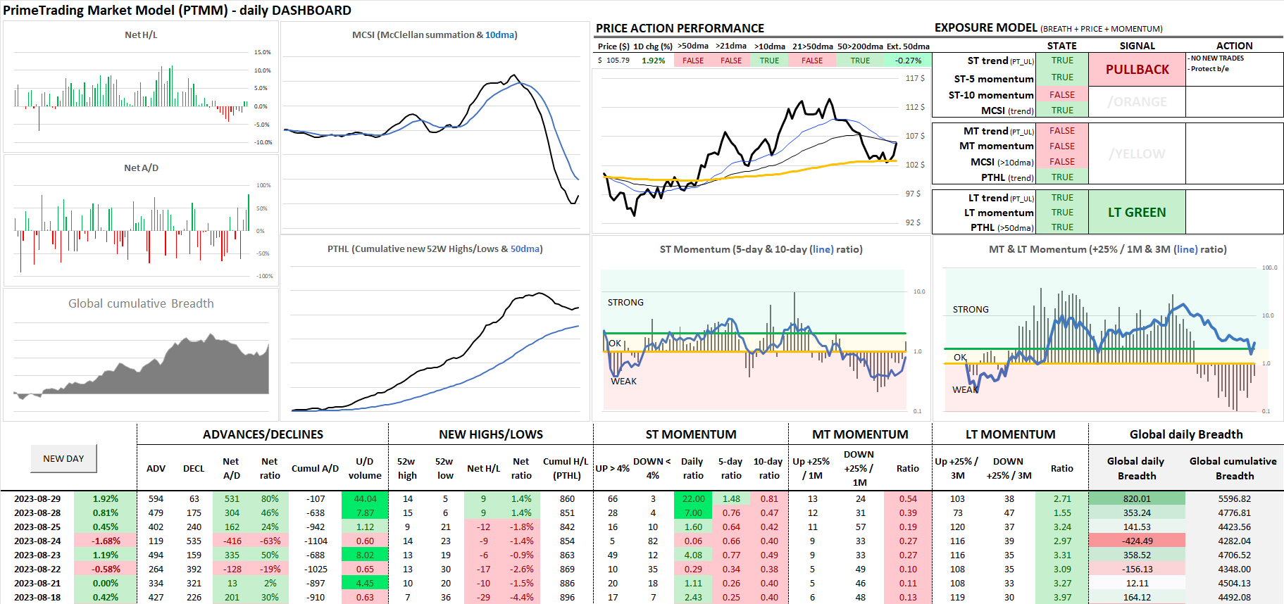
The PTMM Online daily dashboard serves as the central hub of information and critical indicators for the model, offering traders a comprehensive overview of the market's health and direction. It condenses essential data and indicators into an easily digestible format, ensuring traders have all the necessary information.
Here's what the PTMM dashboard includes:

Pro Tip: Press CTRL-Q to open a command pop-up window to get any stocks chart.
One year of complete historical data is included:

Pro Tip: Press on any row to open a mini-chart pop-up of this day’s market.

BREADTH
ADVANCES/DECLINES

Advances and declines track the number of assets that have seen their prices increase or decrease during a specified timeframe, often daily.
Advances: More advances indicate that more assets are experiencing price increases, suggesting a positive market sentiment.
Declines: A higher number of declines means more assets see price decreases, indicating a negative market sentiment.
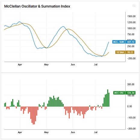
McClellan Summation Index & Oscillator
Pro Tip: Press the 🔍 symbol at the top right corner to enlarge the charts.
Pro Tip 2: Zoom in & out both charts using the mouse scroller.
The McClellan Summation Index is designed to gauge the overall health and direction of the market by analyzing the net advances and declines of a group of stocks.
Here's how the McClellan Summation Index works:
Advances and Declines: The McClellan Summation Index is derived from tracking the daily advances and declines.
Smoothed Indicator: It is a smoothed, cumulative indicator that smooths out daily fluctuations by taking a moving average of the daily difference between the number of advancing and declining stocks. This smoothing helps filter out short-term noise and provides a more comprehensive view of market trends.
Long-Term Trend Analysis: The McClellan Summation Index is used to identify longer-term trends in the market. A rising McClellan Summation Index suggests sustained buying pressure in the market, indicating a healthy and bullish trend. Conversely, a declining index may show a weakening market with a bearish sentiment.
Oscillator: The McClellan Oscillator, which is the foundation for the Summation Index, is a short-term market breadth indicator calculated as the difference between the 19-day and 39-day exponential moving averages (EMA) of net advances. It is useful for identifying overbought and oversold conditions in the market. When the oscillator is positive, it indicates that the short-term average is above the long-term average, suggesting bullish momentum. Conversely, a negative oscillator value indicates bearish momentum.
Action: MCSI is one of the primary tools for me to get involved early in anticipation of a market turn, even before the PTMM signal changes.
On market tops, I like to reduce my positions or short the market when I see MCSI curling back down and pushing it even more when it crosses the 10dma.
I like to test the market on market bottoms when I see MCSI curling back up and pushing it even more when it crosses the 10dma.
The McClellan Oscillator adds an additional layer of analysis, offering more immediate insights into market extremes, while the Summation Index provides a broader, long-term perspective. Together, they help in making more informed trading decisions.
UP/DOWN VOLUME
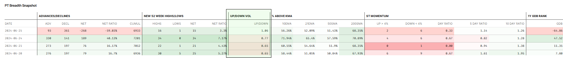
Up and down volume measures the total trading volume of assets that have risen (up volume) or fallen (down volume) in price during a particular period.
Up Volume: High up volume suggests that assets rising in price have substantial trading activity, which can confirm bullish momentum.
Down Volume: High down volume indicates that assets falling in price have significant trading activity, confirming bearish momentum.
NEW HIGHS/LOWS
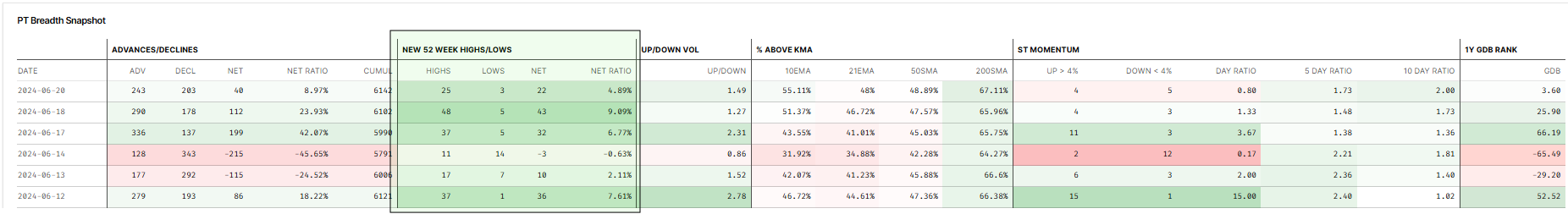
Net new highs and lows represent the number of assets in a market that are reaching new high or low prices over a specific period, typically for the last 52 trading weeks.
Net New Highs: A high number of net new highs indicates that many assets are reaching new high prices, which can signify bullish sentiment and market strength.
Net New Lows: Conversely, many net new lows suggest that many assets are hitting new low prices, indicating bearish sentiment and market weakness.
Cumulative 52 Week Highs/Lows

Pro Tip: Press the 🔍 symbol at the top right corner to enlarge the charts.
Pro Tip 2: Zoom in & out both charts using the mouse scroller.
This indicator tracks the cumulative net new highs or lows over time.
A rising cumulative new 52-week high line suggests that many stocks are in strong uptrends, indicating a healthy and bullish market. It reflects broad-based buying interest and positively signals the market's overall health.
Bar Graph Explanation:
The bar graph below the cumulative line chart shows the net new high/low readings for each day.
Green Bars: Represent the days when there were more new highs than new lows, indicating bullish market sentiment.
Red Bars: Represent the days when there were more new lows than new highs, indicating bearish market sentiment.
The height of the bars corresponds to the magnitude of the net new highs or lows. Larger bars suggest stronger sentiment in either direction.
In the graph, we can observe periods of strong positive sentiment with high green bars, and periods of negative sentiment with red bars. Monitoring these daily readings helps in understanding short-term market movements and potential shifts in sentiment.
This visualization complements the cumulative indicator, offering a more granular view of daily market conditions and reinforcing the broader trends indicated by the cumulative 52-week highs/lows line.
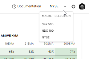
Percent of Stocks Above Key Moving Averages
The graph titled "Percent of Stocks Above Key Moving Avg" provides valuable insights into the market's health by showing the percentage of stocks trading above their key moving averages (21-day, 50-day, and 200-day). This information can be used to assess short-term to long-term market conditions and to identify potential trading opportunities based on oversold or overbought conditions.

Pro Tip: Press the 🔍 symbol at the top right corner to enlarge the charts.
Pro Tip 2: Zoom in & out both charts using the mouse scroller.
Key Elements of the Graph:
21-Day Exponential Moving Average (21 EMA):
This short-term indicator helps identify recent market trends.
High percentage values indicate strong short-term momentum, while low values suggest weakening momentum.
50-Day Simple Moving Average (50 SMA):
The 50 SMA is a widely used mid-term indicator.
A high percentage of stocks above the 50 SMA suggests a healthy market with sustained buying interest, while a low percentage indicates potential market weakness.
200-Day Simple Moving Average (200 SMA):
The 200 SMA is a long-term indicator, often used to define the overall market trend.
A high percentage of stocks above the 200 SMA signifies a strong bullish trend, whereas a low percentage indicates a bearish market environment.
Using Breadth Readings to Assess Market Health
Short-Term Market Health:
Oversold Conditions: When the percentage of stocks above the 21 EMA drops below 25%, it indicates that the market is oversold. This could present a short-term buying opportunity as the market may be poised for a rebound.
Overbought Conditions: Conversely, when the percentage rises above 75%, the market is considered overbought. This could signal a potential short-term top and a possible selling opportunity.
Mid-Term Market Health:
Oversold Conditions: A low percentage of stocks above the 50 SMA suggests that the market might be oversold in the mid-term, indicating a potential buying opportunity.
Overbought Conditions: A high percentage above the 50 SMA may indicate that the market is overbought, suggesting caution for potential profit-taking or short positions.
Long-Term Market Health:
Oversold Conditions: If the percentage of stocks above the 200 SMA falls below 25%, the market is in a long-term oversold condition, potentially indicating a significant buying opportunity.
Overbought Conditions: When the percentage exceeds 75%, the market is considered overbought in the long-term, which might signal the need for caution or profit-taking.
Timing Trades Using Breadth Conditions
Identify Opportunities: Use the breadth readings to identify potential entry and exit points. Oversold conditions typically present buying opportunities, while overbought conditions suggest selling or trimming positions.
Monitor Trends: Keep an eye on the trends in these indicators. A rising percentage of stocks above key moving averages indicates improving market health, while a declining percentage suggests weakening conditions.
Daily Market Breadth Snapshot
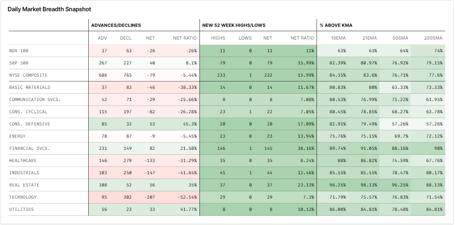
Pro Tip: Press on any row to open a mini-chart pop-up of today’s market or sector.

The Daily Market Breadth Snapshot provides detailed breadth readings for various stock markets and sectors. This includes advances/declines, new 52-week highs/lows, and the percentage of stocks trading above key moving averages (10-day, 21-day, 50-day, and 200-day).
Advances/Declines:
ADV: Number of advancing stocks.
DECL: Number of declining stocks.
NET: Net advances (advances minus declines).
NET RATIO: Net advances as a percentage of total stocks.
New 52 Week Highs/Lows:
HIGHS: Number of stocks reaching new 52-week highs.
LOWS: Number of stocks reaching new 52-week lows.
NET: Net new highs (highs minus lows).
NET RATIO: Net new highs as a percentage of total stocks.
% Above Key Moving Averages (KMA):
10EMA: Percentage of stocks above their 10-day exponential moving average.
21EMA: Percentage of stocks above their 21-day exponential moving average.
50SMA: Percentage of stocks above their 50-day simple moving average.
200SMA: Percentage of stocks above their 200-day simple moving average.
Explanation of Breadth Readings for Markets and Sectors
These breadth readings are available for every stock market and sector, making this tool incredibly versatile. It allows traders and investors to:
Identify Strength: By comparing the breadth readings across different sectors and markets, one can quickly identify where the strength lies. For example, sectors with high percentages of stocks above their key moving averages or with more new highs than lows are considered strong.
Time Sector Trades: This tool is useful for timing sector trades. When a sector shows oversold breadth conditions (e.g., a low percentage of stocks above their key moving averages), it might indicate a buying opportunity. Conversely, overbought conditions might suggest a selling opportunity or the need to trim positions.
Monitor Market Health: By keeping track of the advances/declines and new highs/lows, investors can gauge the overall market health and detect potential turning points. For instance, a high number of new lows could signal market weakness, while a high number of new highs could indicate bullish sentiment.
Using Breadth Readings for Market and Sector Analysis
Here's how to interpret the breadth readings for effective market and sector analysis:
Compare Across Markets and Sectors: Look at the net ratios and percentages of stocks above their moving averages across different sectors to spot relative strength and weakness.
Monitor for Divergences: Keep an eye on divergences where the market index might be moving up, but the breadth indicators show underlying weakness. This could signal an upcoming reversal.
Identify Trend Continuation or Reversals: Consistent high breadth readings in a sector might indicate a strong continuation of the trend, while sharp declines in breadth might suggest a potential reversal.
Interactive Feature
Each sector or market in the Daily Market Breadth Snapshot is clickable. By clicking on a sector or market, a mini-chart pop-up will open, allowing you to watch the price action of the selected sector in real-time. This feature provides an immediate visual representation of the sector's performance, helping to make more informed trading and investment decisions.
By utilizing the Daily Market Breadth Snapshot, traders and investors can make more informed decisions, capitalize on sector-specific opportunities, and better manage their portfolios.
MOMENTUM

Upward Momentum (Bullish): Asset prices rise when a market experiences upward momentum and buyers are in control. This often occurs when there is positive news, strong investor sentiment, or increased demand for equity assets. Swing traders may seek to capitalize on upward momentum by buying assets, expecting prices to move quickly and continue to rise.
Downward Momentum (Bearish): Conversely, when a market has downward momentum, asset prices are falling, and sellers are dominating the market.
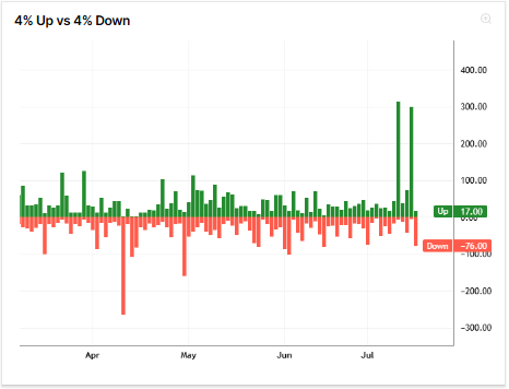
DAILY RATIO
The ratio between stocks that are up 4% or more versus stocks that are down 4% or more on a given day is a daily momentum indicator used in stock market analysis. This ratio is often called the "4% Up/Down Ratio" or "4% Up/Down Day."
Pro Tip: Press the 🔍 symbol at the top right corner to enlarge the charts.
Pro Tip 2: Zoom in & out both charts using the mouse scroller.
Here's an explanation of how this works:
Calculation: To calculate the 4% Up/Down Ratio, I count the number of stocks that have increased in price by 4% or more on a given day and divide it by the number of stocks that have decreased in price by 4% or more on the same day.
Interpretation: The resulting ratio provides insights into the overall momentum or sentiment of the market for that specific day.
Ratio > 1: If the ratio is greater than 1, it indicates that there are more stocks up 4% or more than those down 4% or more. This suggests bullish momentum for the day, with more stocks experiencing significant price increases.
Ratio < 1: Conversely, if the ratio is less than 1, it means there are more stocks down 4% or more than there are stocks up
Extremes: Extreme readings could be seen as climatic moves and be treated as contrarian to either take profits or get engaged early.
5 & 10-day ratio
The 5 and 10-day ratio between stocks up 4% versus those down 4% on the day is a short-term momentum indicator that assesses the strength and direction of momentum in the market over a short-term period.
Here's an explanation of how it works:
Calculation: To calculate the 5-day ratio, I count the number of stocks that have risen by at least 4% from their previous day's closing prices over the last five trading days and compare it to the number of stocks that have fallen by at least 4% over the same period. Similarly, the 10-day ratio looks at the same comparison over the last ten trading days.
Interpretation:
5-Day Ratio: This ratio provides insight into the short-term momentum over the past week. A high 5-day ratio (more stocks up 4% compared to down 4%) indicates short-term solid bullish momentum, suggesting that recent days have seen more stocks experiencing significant price increases. Conversely, a low ratio means short-term bearish momentum.
10-Day Ratio: This ratio extends the analysis to the past two weeks. A high 10-day ratio indicates stronger short-term momentum, reflecting a sustained bullish sentiment over the past two weeks. A low ratio, on the other hand, suggests a bearish sentiment over the same timeframe.
PRICE ACTION

As a trend swing trader, I effectively use a combination of very short-term (10-day), short-term (21-day), medium-term (50-day), and longer-term (200-day) moving averages, along with the 10/21 and 50/200 crossovers, to comprehensively assess the market trend and position themselves accordingly.
Here's a step-by-step explanation of how to use these moving averages and crossovers:
Very Short-Term Moving Average (10-day EMA):
Trend Confirmation: The 10-day moving average reacts quickly to recent price changes, confirming very short-term trends.
Short-Term Moving Average (21-day EMA):
Short-Term Trend: The 21-day moving average provides insight into short-term trends and helps confirm trend direction.
Medium-Term Moving Average (50-day SMA):
Intermediate-Term Trend: The 50-day moving average is a commonly used timeframe for assessing intermediate-term trends.
Longer-Term Moving Average (200-day SMA):
Long-Term Trend: The 200-day moving average is instrumental in evaluating the market's long-term trend.
Short-term Crossovers - 10/21:
Bullish Signal: A bullish crossover occurs when the 10-day MA exceeds the 21-day MA. This suggests a short-term positive shift in momentum and can be seen as a potential entry signal for short-term swing trades.
Bearish Signal: A bearish crossover occurs when the 10-day MA crosses below the 21-day MA. This signals a short-term negative shift in momentum and can be considered a potential exit signal for short-term positions.
Medium-term Crossovers - 21/50:
Bullish Signal: A bullish crossover occurs when the 21-day MA crosses above the 50-day MA. This suggests a medium-term positive shift in momentum and can be seen as a potential entry signal for medium-term swing trades.
Bearish Signal: Conversely, a bearish crossover happens when the 21-day MA crosses below the 50-day MA. This signals a medium-term negative shift in momentum and can be considered a potential exit signal for medium-term positions.
Long-term Crossovers - 50/200:
Golden Cross (Bullish): When the 50-day MA crosses above the 200-day MA, it's known as a "Golden Cross." This crossover is a strong bullish signal, suggesting a potential longer-term uptrend. Swing traders may view this as an opportunity to enter or add to long-term positions.
Death Cross (Bearish): Conversely, when the 50-day MA crosses below the 200-day MA, it's known as a "Death Cross." This crossover is a strong bearish signal, indicating a potential longer-term downtrend. Swing traders may use this to consider exiting or shorting positions.

GLOBAL DAILY BREADTH (GDB)

To calculate my "GLOBAL DAILY BREADTH" (GDB) score, I create a composite score that combines these indicators below to assess the overall market breadth for a given day. The GDB score aims to capture the breadth and strength of market movements across various aspects.
Here's a step-by-step explanation of how I calculate it:
Daily Price Change:
Calculate the average daily price change for the broad market. This is done by summing up the price changes of individual securities or the index constituents and dividing it by the number of securities.
Daily Net Advance/Decline Ratio:
Calculate the number of advancing stocks (stocks that went up in price) for the day and divide it by the number of declining stocks (stocks that went down in price). This ratio measures market breadth in terms of the number of stocks participating in the move.
Daily U/D Volume:
Calculate the total volume of shares traded in advancing (U) stocks and declining (D) stocks for the day. I calculate the U/D volume ratio by dividing the total U volume by the total D volume. This reflects the volume dynamics of advancing and declining stocks.
Net New High/Low (52w) Ratio:
Calculate the number of stocks making new highs and divide it by the number of stocks making new lows for the day. This ratio indicates whether more stocks are reaching new highs or new lows and reflects market sentiment.
Daily Momentum Ratio:
The ratio between stocks that are up 4% or more versus stocks that are down 4% or more on the day is referred to as the "4% Up/Down Ratio".
Once I calculate these indicators for a given day, I combine them into my GDB score.
Here's the approach to creating the composite score:
Weight Assignment: Assign weights to each indicator based on their relative importance (secret sauce).
Standardization: Standardize the values of each indicator to ensure they are on a consistent scale. This involves transforming the values into % ratios.
Weighted Sum: Multiply each standardized indicator by its assigned weight.
Composite Score: Sum up the weighted, standardized indicators to calculate the daily GDB score.
The GDB score is a normalized -100 to +100 score based on the last year's historic scores, with +100 being the strongest day of the last year and -100 the weakest. A higher score suggests broader market participation and strength, while a lower score indicates weaker market breadth.
Interpretation:
GDB > +80: Breadth Thrust
GDB < -80: Distribution
Uptrend:
During an uptrend, I’ll want to see steady positive readings during the ascent, with low to medium negative readings during pullbacks.
During the uptrend, I want to see GDB between +20 and +80.
After an extended uptrend, a GDB > +80 could signify an exhaustion move, especially if we are already extended for kma’s.
Once a pullback is confirmed, I want to see GDB stay contained above -80. Otherwise, it’s a distribution sign.
Following a shallow pullback, a GDB breadth thrust reading > +80 is a good confirmation for upside continuation.
Market Bottom:
If the market makes a higher low while in a confirmed downtrend, and GDB shows a breadth thrust reading, then it’s considered as a follow-through day (FTD) and potential market bottom.
Market Top:
If the market makes a lower high while in a confirmed uptrend, and GDB shows a distribution reading, then it’s considered as a potential market top.
TREND STATE MODEL

We developed the Trend State Model to gauge the market trend state and identify different buying, selling, or shorting opportunities based on key indicators such as price, breadth, and momentum. This model provides a comprehensive view of market conditions by analyzing data across short-term, mid-term, and long-term timeframes.
By leveraging these indicators, the Trend State Model helps traders make informed decisions and optimize their strategies.
TREND STATE MODEL:

UPTREND:
If short-term, mid-term and long-term conditions are positive.
Confirms a strong market uptrend.
PULLBACK:
If short-term conditions are negative and long-term conditions are positive.
Indicates a temporary market pullback in a long-term uptrend.
CORRECTION:
If mid-term and long-term conditions are negative.
Signals a broader market correction.
RALLY:
If short-term conditions are positive and long-term conditions are negative.
Suggests a short-term rally within a weaker market.
UPTREND ATTEMPT:
If mid-term conditions are positive and long-term conditions are negative.
Shows an attempt at starting a new uptrend.
SECONDARY STATES:
Short-Term Buying Opportunity:
If PULLBACK is TRUE.
Criteria: (Stocks >20dma OR 10dma) < 25% and hook up (higher than the previous day by >1%).
Indicates a short-term buying opportunity during a pullback.
Long-Term Buying Opportunity:
If CORRECTION is TRUE.
Criteria: (Stocks >200dma AND 50dma) < 25% and hook up (higher than the previous day by >1%).
Signals a long-term buying opportunity during a correction.
Shorting Opportunity:
If RALLY is TRUE.
Criteria: (Stocks >20dma OR 10dma) > 75% and hook down (lower than the previous day by >1%).
Suggests a shorting opportunity during a rally.
Trimming Opportunity:
If UPTREND is TRUE.
Criteria: (Stocks >20dma OR 10dma) > 75% and hook down (lower than the previous day by >1%).
Indicates a trimming opportunity during an uptrend.
MARKET DATASETS:
S&P 500 (RSP - Equal Weight)
Type of Market: Large-cap U.S. stocks
Components: 500 companies from the S&P 500, equally weighted
ETF/Market Highlights: The RSP ETF provides exposure to the S&P 500 index with an equal weighting to each company, giving smaller companies the same influence as larger ones.
Nasdaq 100 (QQQE - Equal Weight)
Type of Market: Technology and growth-oriented U.S. stocks
Components: 100 companies from the Nasdaq-100, equally weighted
ETF/Market Highlights: The QQQE ETF offers exposure to the Nasdaq-100 index, but with an equal weight for each company. This setup highlights the performance of smaller tech and growth companies, balancing the influence of tech giants like Apple and Microsoft with other innovative firms.
NYSE Composite (^NYA)
Type of Market: Broad U.S. stock market
Components: Thousands of companies listed on the NYSE
Market Highlights: The NYSE Composite Index provides a broad representation of the performance of all common stocks listed on the New York Stock Exchange, covering a wide range of industries and sectors.
Russell 2000 (IWM)
Type of Market: Small-Cap U.S. stock market
Components: 2,000 small-cap companies
Market Highlights: The Russell 2000 Index represents the smallest 2,000 companies in the Russell 3000 Index, which itself includes 3,000 of the largest U.S. stocks. The Russell 2000 is widely regarded as a benchmark for small-cap stocks, providing a comprehensive overview of the performance and trends within the small-cap sector. This index covers a diverse range of industries, offering insights into the more agile and growth-oriented segment of the U.S. equity market.
REAL-LIFE EXAMPLES (using old excel dashboard)
STRONG UPTREND

STRONG DOWNTREND
BOTTOMING ACTION

TOPPING ACTION


Private DISCORD channel (DISCORD MEMBERSHIP)
PrimeTrading is an equity swing trading community to learn & trade alongside experienced traders.
✅ See how I execute intraday while I share my trades live.
✅ Alex's daily market commentary, Portfolio updates, trade explanations, and daily FocusList.
✅ Share & Discuss potential trade ideas with a like-minded amazing community
✅ Talk Macro Economy, Cryptocurrencies & much more!
✅ Talk about mental game & psychology to evolve as a trader!
✅ Education & mentoring from Alex & experienced traders.
✅ Q&A zoom meetings
Improve as a trader with a risk management first approach while working directly with me intraday.
I hope you liked this article! Let me know your thoughts in the comments below.
Here is what you can do to help make them possible and support my work.
Leave a like on this post below.
Share this post on Twitter using the button below.
Alex ✌️🛡️
Hi Alex, what is the ETA for TradersLab?
Hi Alex, thanks for the great work you are doing? Is this PTMM available for us to interact with as part of our subscription or only via the daily blogs screenshots you send out. The article indicates we can access the dashboard and screener but I'm not sure how I am able to get access? Could you let me know if this is possible and how I access? Thanks